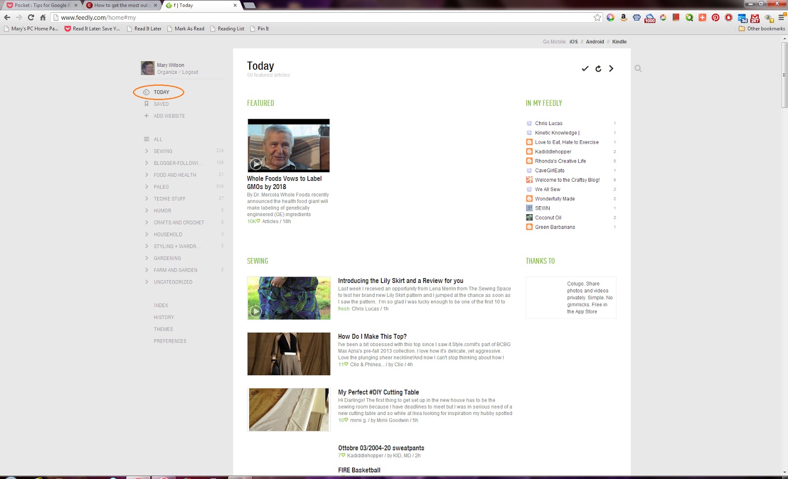
Ah, you see, I could have been wrong about a replacement for Google Reader.
For example, when seeming to diss Feedly, I had not done enough research on it yet.
I learned that Feedly CAN be set to look similar to Google Reader. Well, not eXACTly, but similar in that blog posts shown as lists. First, when viewing one of the categories on the left, select the settings (gear) icon at upper right:
Then the settings menu appears:
Select the Titles View at the top of the settings menu. The feeds will now appear as lists:
Select Preferences at lower left, and the Preferences menu will appear. Change the Default View to Titles Only (similar to Google Reader). Scroll down to see other available settings. Play with the settings that interest you to see what they do:
There are other ways to View blog posts in Feedly. The Settings menu and the Preferences menu both allow for this. The Preferences menu should change all the views except for the Today view:
This screen shot shows that there are 235 unread blog messages in the Sewing category. A click on the unread count marks them all as having been read The 20 indicates "Likes" on facebook and Google+ for the Male Pattern Boldness blog post shown:
Another way to mark all as read is in the Settings menu:
Another interesting view is the Index, which seems to me a bonus feature:
If there are no unread blog posts AND the Settings filters are set to show Unread only, most feed views will come up empty:
This could happen if there are only a few unread blog posts AND the Settings filters are set to show Unread only:
This is a typical view if the Settings filters are NOT set to show Unread only, since the read items appear grayed out and the unread items are bold:
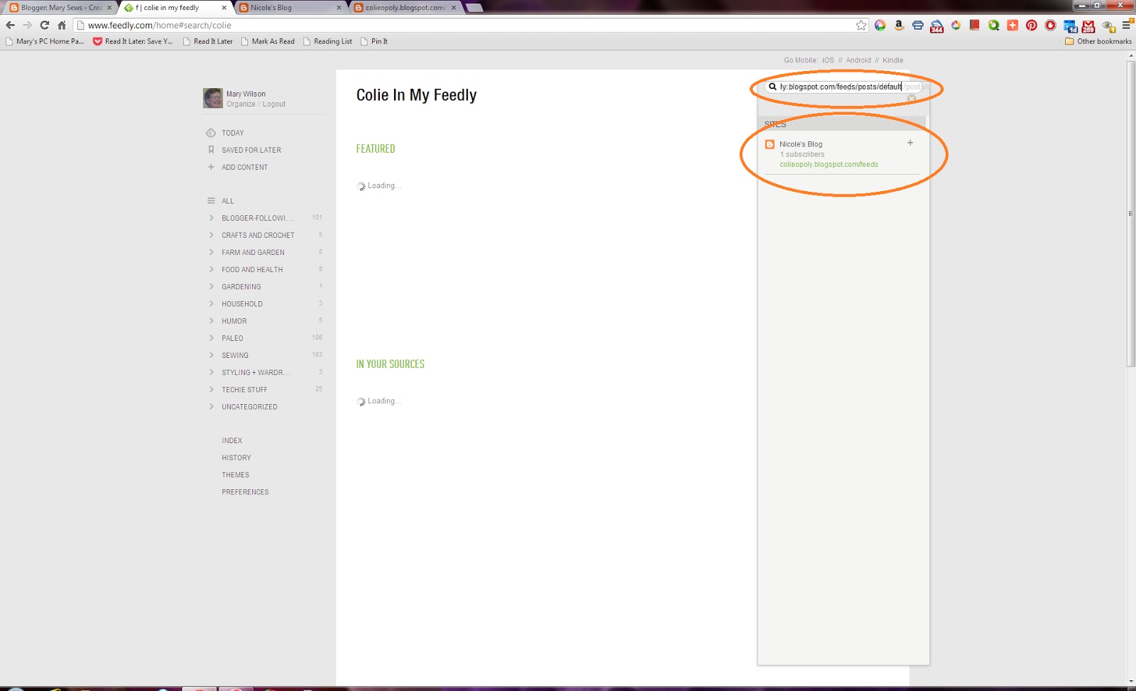
The Add Content selection on the left causes the Search box to open:
To add my daughter's (never-used) blog, I found the feed link (mentioned in my previous post here) and pasted it into the Search box:
At this point, the category can be changed, or a new category can be added:
I find this a little easier than the method used by NetVibes.
As of now, the feature I like most in NetVibes is the Widget view, which lets me see posts grouped by blog. By the way, each blog feed box can be dragged to a different location on the category page:
Perhaps you can tell -- I am getting rather used to Feedly. I really like the search feature. I like the method to add a new blog feed. I like the "show unread only" view. I like much more about it than I did just a few days ago.
OK, I really like Feedly!
But I still think you should try several RSS feed readers and make up your own mind!


+(7)+-+Google+Chrome+3212013+95557+PM.bmp)
I am using Bloglovin and Feedly. Like you I am getting more use to Feedly! Now have it on my iPad also. Your new information is helpful to me and thanks for sharing.
ReplyDelete